The short answer
- No two screens agree, and none of them agrees with ink on fabric
- Ask for a colour reference, not a picture — a code you can mix to
- The garment colour underneath changes the result, even with a white underbase
- Spot colour matches; digital approximates — say which you are doing
- Record the mix against the customer so the reorder matches the original
Colour is the most common cause of a disappointed customer in decorated apparel, and almost never because anyone did anything wrong. It happens because the customer approved something on a screen and received something on fabric, and those were never going to be identical.
Managing that expectation is most of the job. The rest is knowing when an exact match is achievable and saying so honestly when it is not.
Why screens mislead
Three reasons, compounding. Screens emit light while ink reflects it, so the same colour is produced by entirely different physics. Displays are not calibrated — a phone, a laptop and a monitor will each render the same file differently, and the customer is usually on the least accurate of the three.
And ambient light changes what the eye sees. A print matched under warm shop lighting looks different under daylight and different again under an office's fluorescents. That is not a fault in the match; it is how colour works, and it explains disagreements where both parties are looking at the same garment.
Say this once, plainly, before approval rather than after a complaint. A sentence on the proof setting the expectation costs nothing and prevents most of the problem.
Getting a usable reference
What you need is a code, not an image. Asking for "the exact blue" produces a screenshot; asking for the brand's colour reference produces something you can mix to.
Ask for these, in order of usefulness
- A spot colour reference from their brand guidelines
- Their brand guidelines document, which usually contains it
- A physical sample — a previous garment, a printed brochure
- The vector artwork, which often carries named colours
- Failing all of that, your nearest standard colour, shown and agreed
The physical sample is underrated. A previous garment is the most useful reference of all, because it is already ink on fabric — the same medium you are working in — and it removes the screen from the conversation entirely.
Where nothing exists, do not guess silently. Pick the closest colour you stock, tell the customer that is what you are using, and get that agreed. A named approximation everyone accepted is a completely different situation from an unspoken guess.
A screenshot is not a colour reference. It is a photograph of one screen's opinion.
What the garment does to the colour
Ink is not opaque paint, and the fabric beneath affects the result. On a white garment a colour prints close to its mixed value. On a coloured garment, the same ink shifts toward the garment colour unless it is laid over a white underbase — and even then, a thin underbase lets some of it through.
Fabric texture matters as well. A smooth cotton reflects differently from a fleece or a performance knit, so the same ink on three garments in one order can read as three slightly different colours. That is normal and worth mentioning when a store offers several fabric types.
Where an exact match on a dark garment matters, the underbase becomes the critical variable rather than the colour itself. That is a separation decision, and it is worth flagging at quote stage because it can add a screen.
What each process can actually do
| Process | Matching | Notes |
|---|---|---|
| Screen, spot colour | Can match closely | Ink mixed to the reference |
| Screen, process | Approximates | Built from four transparent inks |
| DTG | Approximates | Fixed ink set, no custom mixing |
| DTF | Approximates | As DTG; often more vivid |
| Embroidery | Nearest thread | Discrete range, not mixable |
| HTV | Stock colours only | Whatever the supplier makes |
Only the first row can genuinely match a specified colour, because it is the only one where you mix ink to a reference. Everything else selects from a fixed range, and the honest description is closest available rather than matched.
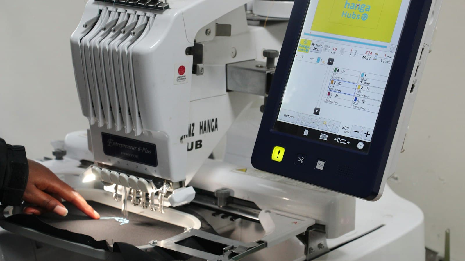
Embroidery is the clearest case and the easiest to explain. Thread comes in discrete colours; there is no mixing. A customer whose brand colour falls between two threads gets one of them, and showing them both is a better conversation than promising a match.
What to promise
Say what you can do and offer a way to be certain. The sentence that works covers both.
On every proof
"Colours on screen are a guide — every display renders differently and ink on fabric will not match a monitor exactly. If you have a brand colour reference, send it and we will mix to it. If an exact match is critical, we can print a physical sample before the run so you are approving the real thing."
The sample offer is the important half. It converts an unmanageable expectation into a priced option, and a customer who declines it has effectively accepted the tolerance. Charge for it and credit it against the order if they proceed — that is fair to both sides and it gets taken up exactly when it should be.
Never promise a match on a process that cannot deliver one. A shop that says "we'll match it" on a DTG job has created a complaint it will lose, because the customer will hold you to the word.
Recording the match
Once a colour is agreed, record it against the customer — the reference, the ink or thread actually used, and any mix ratio. That record is what makes the reorder match the original.
Without it, the second run is mixed from scratch by whoever is on shift, and lands close but not identical. The customer notices, cannot articulate why, and concludes your quality is inconsistent — which is the most damaging conclusion available and the easiest to prevent.
Keep it with the artwork and the approved proof rather than in a notebook, so it is reachable by whoever produces the repeat. That is the same reason separations and mesh counts belong on the account: a reorder should start from evidence rather than from memory. The rest of the artwork archive assumes you got a reference before you mixed anything.